The Where screen
What you actually spent, by category, over a range you choose.
Pick a range across the top — this month, last month, three months, a year — and the report runs itself. The account is chosen in the open, so you always know what you are looking at.
Spending is broken down by category, largest first, each with a bar showing its share. Income is listed separately, because mixing the two produces a total that means nothing.
All accounts, the first choice in the account picker, adds every account together in your home currency. One account reports in its own.
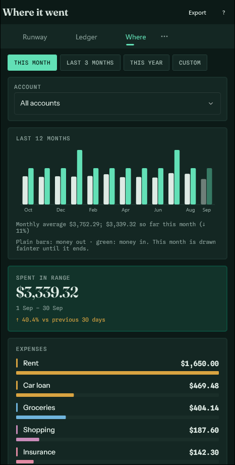
The last twelve months#
Under the total, a bar for every month of the last year: money out beside money in. The line under it compares this month with the average of the months before it, which is what turns a total into news. Tap any category to draw its own twelve months.
Export, at the top, writes the report out as a spreadsheet file.
This screen is history. It only counts entries that have actually happened, so a forecast sitting in the ledger does not inflate what you appear to have spent.